Sunday 24 February 2013

My four favourite images from my ancillary text photo shoot

These are my four favourite images from the photo shoot that I did with my brother in the green room. I will now try and find a way to include them in my ancillary texts. My favourite image is the third one down on this post. I think it looks really good for an artist with the ideology that Chris Mallette has of being a singer songwriter.
 
The final image on this post is also really good and I am considering using this image for my album advert that will be published in Q magazine.  


Friday 22 February 2013

Magazine advert photographs

 
I took these images in college against the plain cream wall in the green room. I did this because I would then be able to manipulate the background and the image however I wanted to. Here are a selection of all the poses I asked my brother to pull.
 
 
This is the first image I took of my brother in the green room. I wanted a picture from the side of his face.
 
 
I really like this photo because of the position of the guitar. I'm not happy with how much Chris is squinting in the image though.


I like the two images above because I like the fact the guitar is around the back of him. I think it makes him look "cooler" like this.
 
 
I think this image as his hand on the guitar shows how possessive he is over it and how important his guitar is to him.
 
 
I don't like the tilt of the head in this image and he is squinting too much because of the lights.
 
 
I don't think looking to the side works very well.
 
 
I think this is one of my favourite if not my favourite image from the photo shoot. I think it shows everything the artist stands for and I think it is just a really lovely picture.
 
 
This is the same as the image above although I don't like the shadow in this image.
 
 
This is also one of my favourite pictures from the photo shoot.
 
 
I really don't like the images where I asked Chris to look to the side.


I think the three images above near the Humber Bridge show that he is a relaxed kind of person and I think that is good in an artist especially a songwriter.
 
 
I like this image of him smiling. I actually took this photo when my mum had made Chris laugh and he had looked away from the camera but I think it is nice.


The three pictures above again show that he is a chilled out person like musicians usually are. Out of the three I think image number 2 is my favourite.


The three images above a nice but I don't think they have much to them, especially not for an album cover. Also the cars in the background are not good.


I prefer the two images above to the previous tree images because they have the river and the bridge in the background but because of where he is stood, the light is behind him which makes him a bit of a silhouette and they are dark images.

Sunday 17 February 2013

Album release dates

On the first draft of my album advert I wrote that the release date of the album would be the 4th of July 2013.


When I did more research I realised that this date was a Thursday which is not a typical release date for an album. I found that the typical day to release a single in the UK is midnight on a Saturday/Sunday morning and that the typical day to release and album in midnight on Sunday/Monday morning. This allows the weeks for themusic to climb up the charts and hopefully for the artists to make a huge difference in the chart.

Here are two examples of release dates:


Saturday 16 February 2013

Institution

To begin with I went onto the three major record label's sites: Universal Music Group, Sony and Warner Music Group.  I researched the subsidury labels that the have and which artists they had signed for them. I did this by looking at their official websites, some of which have an American website and a UK website. The main lables that I looked at were: Mercury, Island, Polydor and Atlantic.

After a lot of deliberation I decided Chris Mallette would be signed to Atlantic Records, a subsiduary of Warner Music Group. I made this decision because:


  1. Atlantic have some huge artists signed to wither the UK or US label such as Plan B, Cody Simpson, TreySongz, Fun, Flo Rida, Marina and the Diamonds, Paramore, Bruno Mars to name a few. A few of artists they have signed would fall under the genre of indie which would therefore mean they would hypothetically know how to work with Mallette. This would work in Mallette's favour as they would have a lot of contacts and could allow him to hit the big time quicker.
  2. Atlantic are a well known and renowned record label that have been a subsidiary of the major record label, Warner Music Group since 1967.
  3. Atlantic have a range of successful UK artists signed with them such as Plan B, Marina and the Diamonds, Ed Sheeran, Rudimental, Birdy, Delilah and more. Some of these artists such as Ed Sheeran have had a lot of success in Europe and have also made it to the US. For a young artist like Mallette with a label that could potentially give him that same support is a good place to be.
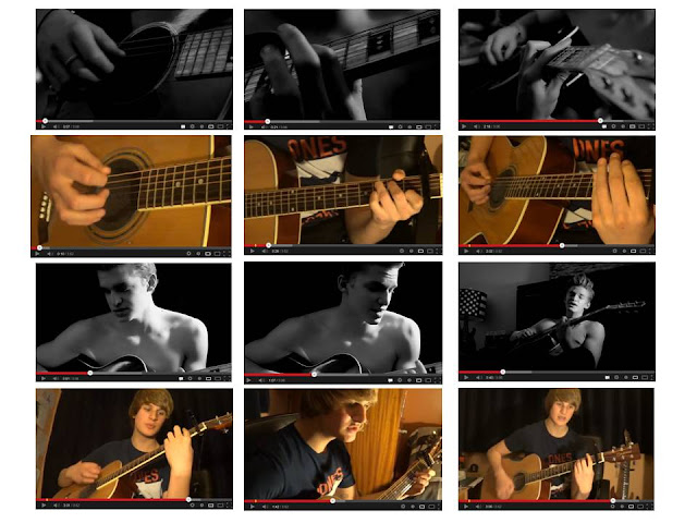
  4. Atlantic have other young stars signed up with them such as 16 year old Australian Cody Simpson. Cody left Australia with his family as a young teen and moved to LA to pursue his music career. In the last few years he has become very popular in the US amongst teenage girls and since he supported Justin Bieber on the UK and European leg of his Believe tour, Cody has gained popularity over here too. The label will know how to deal with teenage boys from their experience with Cody and although Mallette is a year or so older, he will still behave like a teenager. This experience could be useful. Cody is not only a performer but he is a musician and songwriter too like Mallette and in the past week he has released a new video for his latest single. When I watched this I noticed a lot of similarities with my music video. The song is called 'Awake All Night' and is a black and white video. Here are some of the camera shots that I noticed are very similar to my video:


Fueled by Ramen are a New York based company and brand who I also researched and decided he would have a deal with them too because of the success he was having with Atlantic. I also wrote on my website that he was originally signed to the independent record label XL Recordings who have a history with Adele and Vampire Weekend amongst others. To find out all of this information on the institutions Mallette would best suite, I looked at a lot of their official websites.

Album title idea

Since the beginning when I chose to make my music video for "Give Me Love", I knew what the album title would be.

As the artist is Ed Sheeran, I decided to play on the title of his debut album, +. I therefore decided to call Chris Mallette's album "Minus" but decided to use the word rather than the symbol to make it more unique to him.

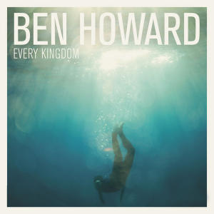
This is the album cover of Ed Sheeran's album:


This is the album cover of Chris Mallette's debut album:


Wednesday 13 February 2013

Annoying fonts

I have made sure throughout my blog I have used the same ofnt on every post to have continuity but for some reson when I press update, some of the text changes font and won't let me change it back. There is nothing I can do about it as it is a different bit of the text every time!

Filming with candles on the decking - risk assessment

 These images are of us filming the candle scenes on the decking.


The two photos above show me and Chris lighting all of the candles before we started to film. The night that we filmed this was very cold and windy and the candles kept blowing out.
 
 
This is how we made sure we were safe in this situation as there was a lot of fire involved. I had the fire extinguisher which is in date and we had this bottle of water plus a bucket and the hose pipe hooked up ready in case something went terribly wrong.
 
 
This image shows me sat away from the fire with the camera filming. I used a lamp which is under my legs in this photograph to light the scene more. I was also sat right next to our safety measures in case something went wrong.
 
 
My brother performing with his hands on his stomach warming them up on the hot water bottle he had under his hoodie to keep him warm.

Monday 4 February 2013

Magazine adverts for albums


This is my favourite of the ablum adverts. I like the fact it uses the album art work. The colour scheme is very simple and the most important text at the bottom stands out because of the colour change.

 
I like the fact that the release date on this advert is large and a different colour to the rest of the bigger text. It makes it stand out.
 
 
I like this image as it is the whole page of the advert. This advert uses the back page of an album rather than the front one. I like this idea too.


This is very simple and it is very clear when the album is released.
 

Sunday 3 February 2013

Album artwork research

These are some of the album artworks I looked at when trying to decide how to make my own.


I love this album cover because it is so simple. Just a close up with her name and the name of the album. I like the black and white too.
 
 
I don't think I like the size of the 5 on this cover but I like the contrast of black and white and bright red.


I love the colours on this album cover.


I love the glasses in this video. The rest of the image is dark but the colour in the glasses is really nice!


This is again very simple but I think it fits the genre well


The colours in this image are fantastic